VideoGP
Back
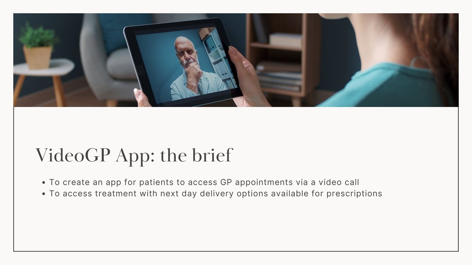
Working alongside our technical partners, during the pandemic Lloyds Online Doctor created and developed an app for face to face video calls with GPs, including prescriptions delivered to your door.
Background
Wireframes were formed after discussions and research groups held with patients and our clinical team (which includes a mixture of GPs, pharmacists and clinicians). The main drive for the build of the app was to access clinical advise remotely during the pandemic. With other pharmacists and competitors having the same initiative as Babylon such as Boots ‘livi’ - it was a no brainer. The main structure of the VideoGP app was formed and launched in early 2021. Today, we continue to optimise and test our journey, including adding in features such as b2b propositions and a new mental health and physiotherapy journey.


Collaboration and building the journey.
When I joined Lloyds Online Doctor when the VideoGP app was in its infancy, with only the initial wires and discussions done. I worked alongside another UX designer from our technical partner company and together we collaborated on Figma and across teams to build the user journey out. The initial journey was simplistic, with only a pay as you go option available.
We worked on building a UI look and feel for the app, making a consistent library with buttons, colour palettes and typeface standardised across figma boards.
Any new parts of the journey were discussed and decided in team stand ups, we then worked in agile sprints with the stakeholders, developers and QA testers to get the next part of the journey built, approved and live.


Launch and results.

Currently the app is in its second year and has a large number of growing users. We have currently acquired b2b customers with large corporate companies offering it as benefit packages to their employees. We are currently building and designing the b2b portal for employers and employees to access.
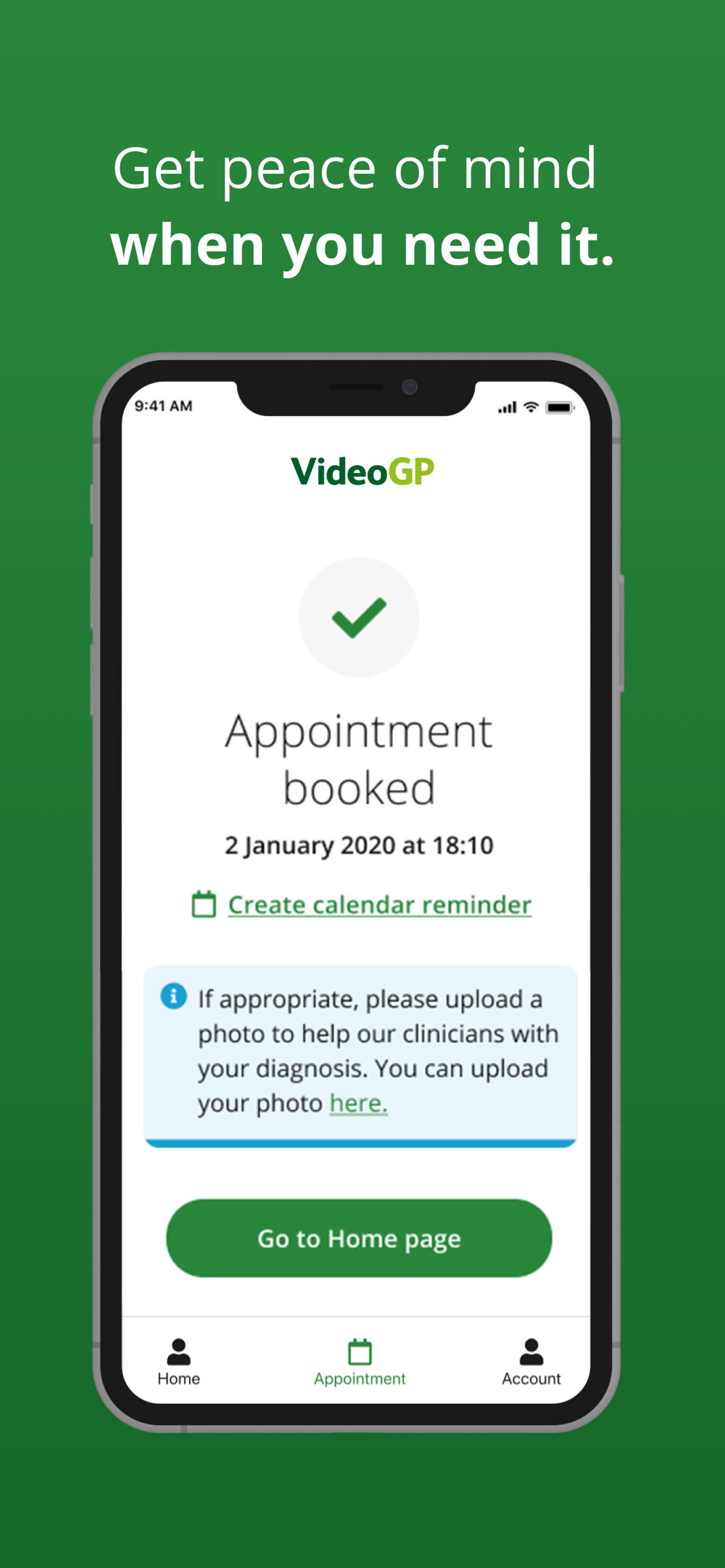
Other features we have added since launch is next day prescription delivery; click and collect feature; an optimised registration journey; biometrics (face ID etc); promo and activation codes; photo upload to help with diagnosis; subscriptions; lifestyle assessments and we are currently working on our mental health flow journey.


Continous improvement.
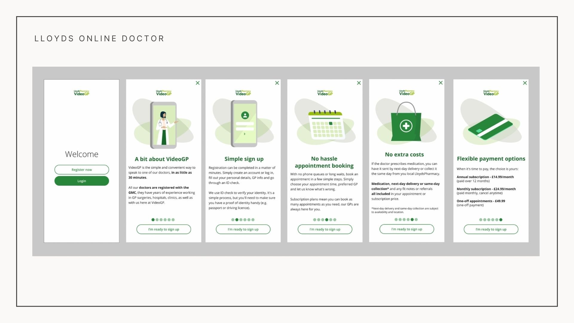
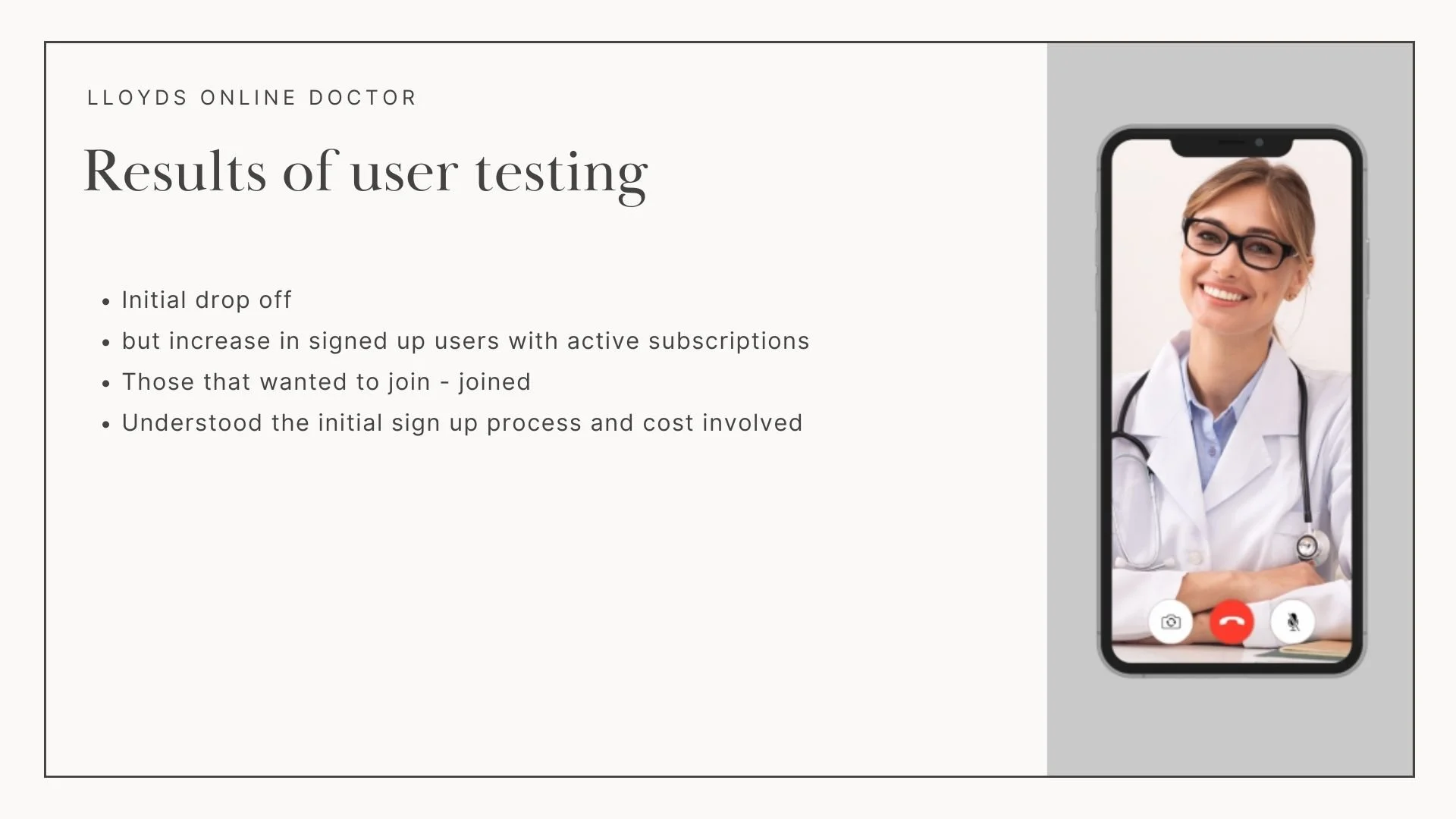
We continuously want to improve the patient’s user journey. After a few months of the app going live, we found because of the long registration steps, we had a significant drop off in users after a certain point. To combat this we decided to see if we could uplift the numbers by adding in introductory screens. This would explain the cost, the registration process and the app premises, rather than the user going through the long sign up process to find out they didn’t want to pay for it or need the app. I created the introductory demo screens and set a remote test with questions for the users to answer after they had been shown the screens. On the whole, the feedback was positive, stating that they would be useful and from this we understood the users had a lot of questions about the app. We created five shorter intro slides (that were skippable) along with a FAQ’s page which linked off to our browser site if anyone needed any more information before signing up.
The result of this was an initial drop off after the screens but an increase in signed up users, rather than users dropping out half way through the sign up process. This means the users who went through the sign up intro screens understood the cost etc and wanted to sign up having read the initial information.