Futureproofing Bupa Apps
As part of the ten week sprint with agency Mero, we explored our colour palette and illustration styles and how they could be better. I have applied this thought process to create new UX/UI for both Bupa Touch and Bupa Be Me app.
What was changed?
I explored illustration style, as there is currently not really any illustration at all on the Bupa site.
I also explored button styles, font size and colour. I found the current colours were very corporate looking and there was no pop in them. We really needed a yellow and a green in our palette we could use that wasn’t designed for print material. I explored options such as softer more tonal backgrounds and more vibrant blues instead of the dulled down originals.

Bupa Be Me: Old vs. New branding rules.
The original Be Me project is currently done with the current Bupa branding, however after the 10 week exploration sprint with Mero, I put some of what we had explored into practice to see how they vary. For the original project see here.

New branding: registration and onboarding

New vs Old branding: reg and onboarding

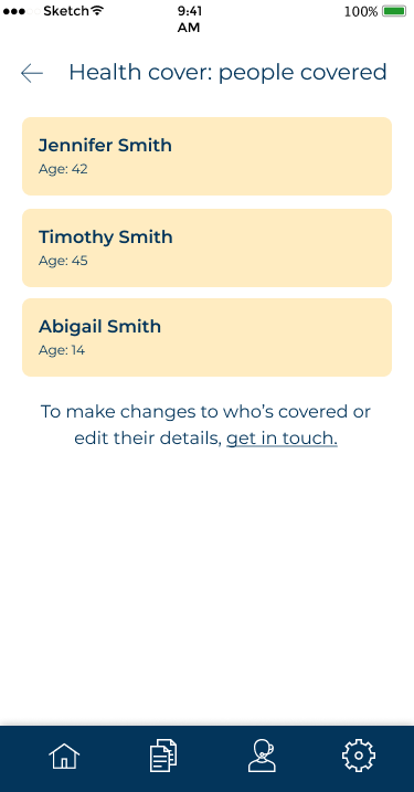
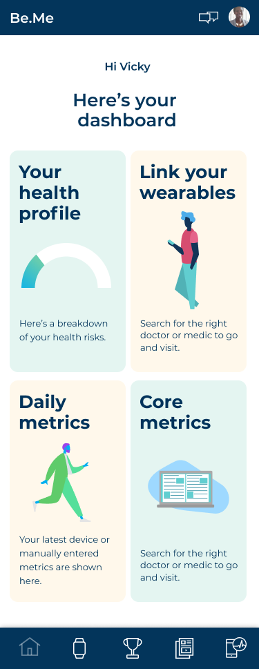
New branding: Your health profile

New vs Old branding: Your health profile

New branding: Form fields

New vs old: Form fields


Bupa Touch: Old vs. New branding rules.
The original Bupa Touch project is currently done with the current Bupa branding, however after the 10 week exploration sprint with Mero, I put some of what we had explored into practice to see how they vary. For the original project see here.

New Branding: Log in and Home screen

New Branding: Documents and address

New vs Old Branding: Documents and address
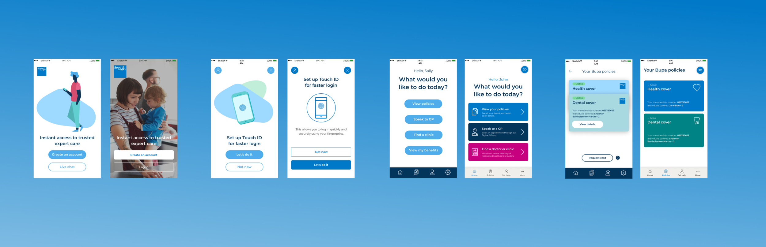
New vs Old Branding: Log in and Home screen