

Bupa Touch App
View your policy documents, book an appointment with your doctor, see your rewards.
Back
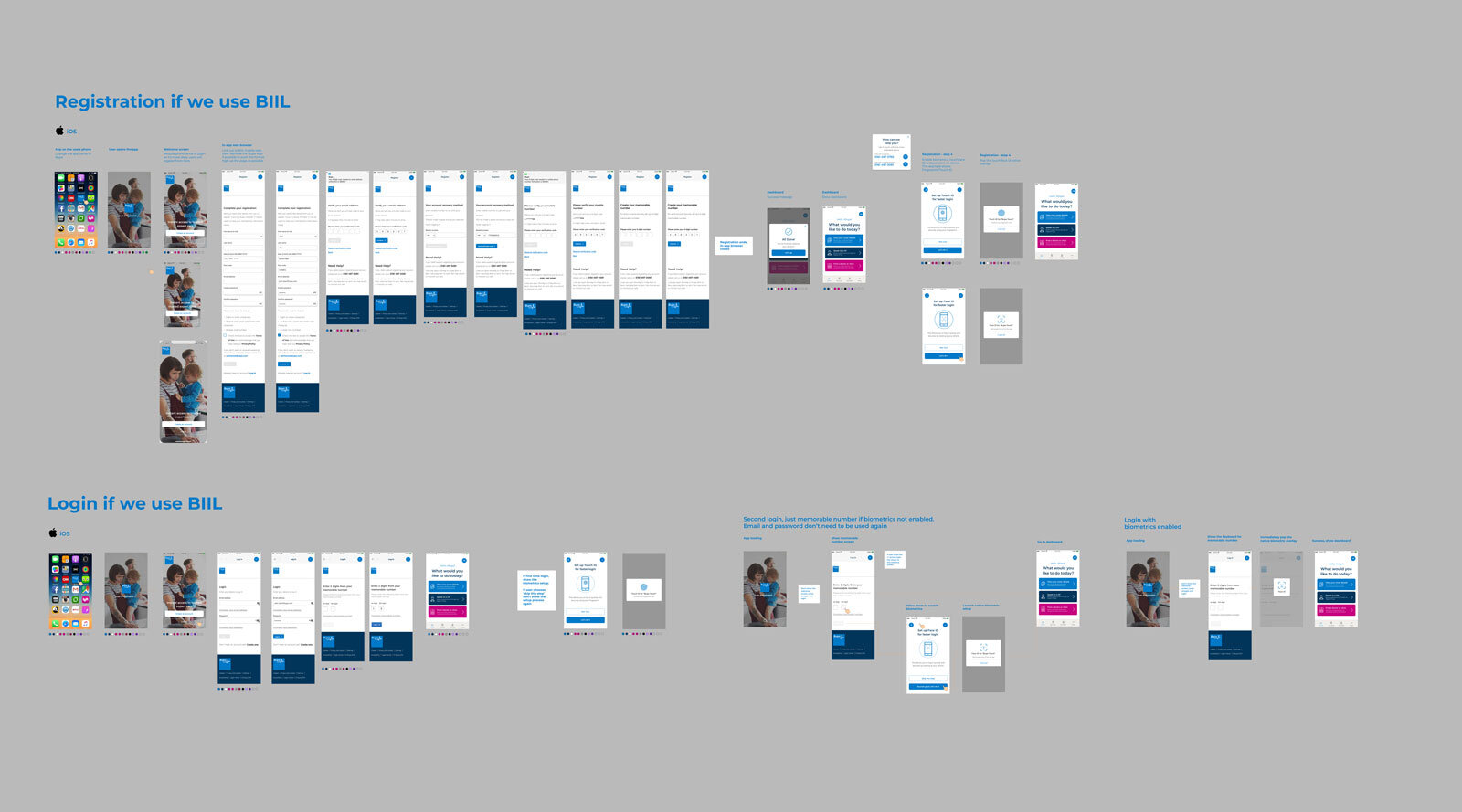
Bupa Touch is an app being brought in to replace an outdated policy viewing and account platform ‘My Bupa’. It allows the user to view their policy details, book and appointment via Babylon and see their rewards as a customer.

The journey.
I worked as Lead UI designer on the sprints, working alongside two UX designers and a team of developers.
As the sprint was tight, the UI is more functional rather than fun, however, it does allow the user to find policy documents with ease and easily navigate around the app.
After the project was completed, I did an explorative piece on how I would have done the UX and UI differently if we were given more creative flexibility on the project.
The app is due to be launched at the end of this year.

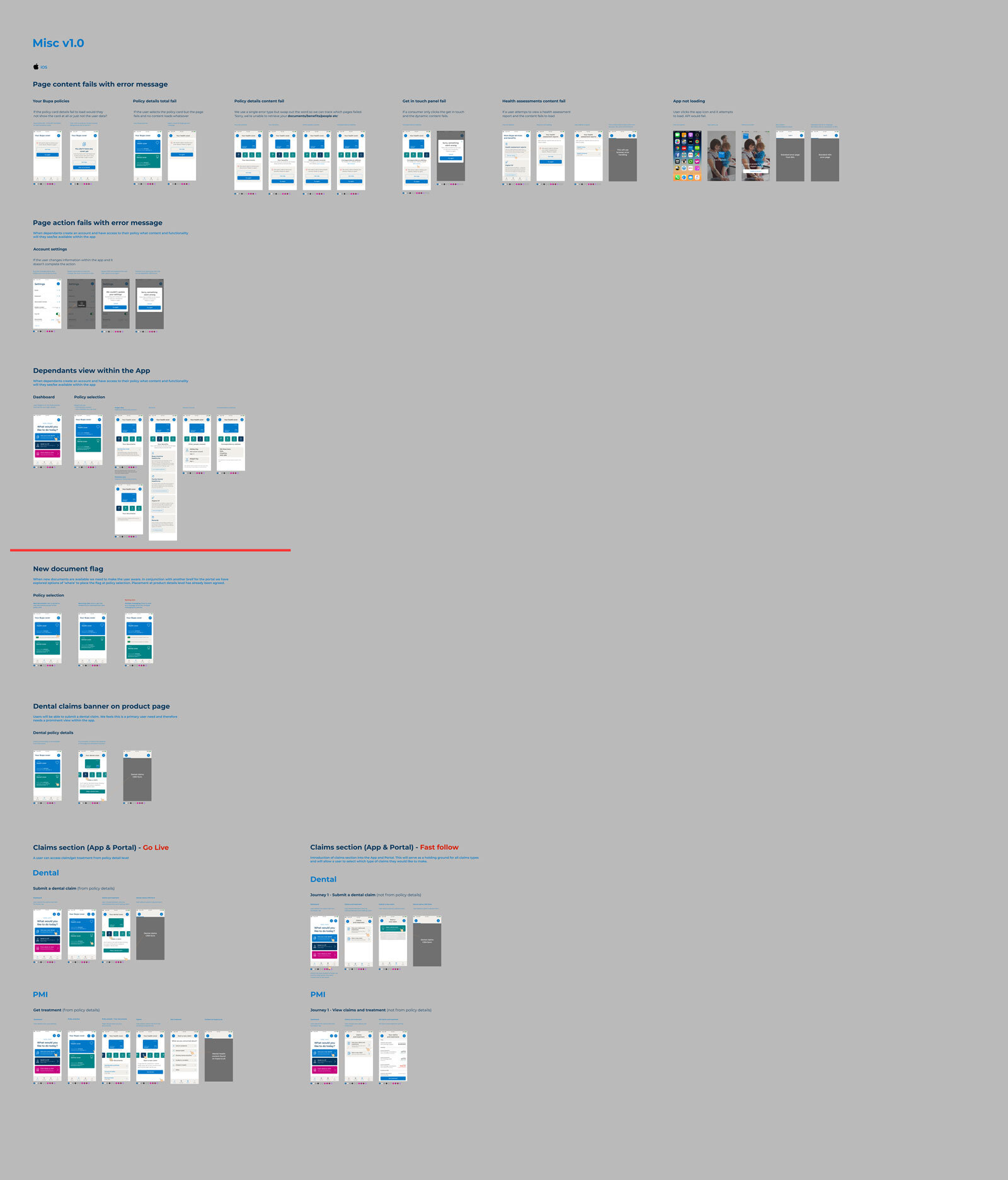
Sprints
The project was run in extremely tight sprints with 2-4 left days for UI. Although this was challenging, the outcome was very precise and organised.
We worked in sprints on Figma from UX - UI - DEV. Split up as shown underneath.


Challenging the existing logo

Current icon.
The current icon is quite plain and I did some exploration work on spotting logos on your mobile device. The ones with more writing and nothing distinct to jump out at the user got lost amongst other apps on the screen. The proposed and current icon were lost and too complicated as a standalone screen.

Exploration.
I began by exploring what we could get away with in terms of ‘less is more’ approach. We had to include the Bupa icon, but I wanted to drop the text within the screen as it is always written underneath the app anyway. I then explored our brand colours and different shades, tones and gradients.

Apply.
I then started to apply the different logos in situ, such as the app store, a crowded mobile device screen amongst other app icons to see if it stands out. Although the stakeholder and the brand team really liked this one, when we proposed it to the legal team the assured us we could not use to logo without the word ‘Bupa’ next to the heartbeat line, they were difficult to get on board with the new gradient and the drop of the name, but we hope to work with them to encourage them to change their minds in the future!